a lot of people complain about how boobs are drawn in porn and i think as long as youre doing it on purpose youre allowed to stylize any way you want, including balloon circle boobs. But if you don’t actually know what you’re doing its good to learn the anatomy first.
so if youre into drawing more natural looking tits heres a short reference.
requested!! its just some stuff ive learned idk dont trust me too much, i had the parts for this laying around for days and was too lazy to put text on it i also added a collage of some chests ive done last minute
Composition for dummies part two: The Dead Center Focal Point!**
I have found that storyboards that use a nice mixture of the “Rule of Thirds” and “Dead Center” focal points are the most visually pleasing. Remember, SHOT VARIETY is good.
I’ve been studying the classic black tie dress code (mainly from here) so I thought I could share my notes. Maybe they can be helpful to someone else, too. If I made any mistakes or things are really confusing please tell me. I also have some notes on white tie which I could share as well…
Lately, I’ve run across complaints that modern depictions of the Knights of the Round Table are too “anime” – giving them all sorts of goofy powers, and sending them on weird, over-the-top adventures.
Allow me to point out that the following are all actual things that appear in the older tales about the Knights:
Sir Kay is said to have had the power to grow to giant size, hold his breath for nine days, and radiate supernatural heat from his hands.
Sir Bedivere openly practiced sorcery, and suffered from an accordingly sinister reputation; on more than one occasion, he was saved from being hanged as a witch only by King Arthur’s testimonly to his good character.
Sir Galahad possessed supernatural strength and speed by virtue of his moral and sexual purity – making him a rare example of a male character with virginity-fueled super powers.
Sir Balin once wielded the Lance of Longinus, and blew up an entire kingdom with a single blow. He also fought an evil knight with the power of invisibility.
Sir Marrock was a freaking werewolf.
Conclusion: modern depctions of the Knights of the Round Table aren’t anime enough.
I made this post two years ago, and while it’s never really taken off, it’s still getting a small burst of additional notes every couple of months. I wonder how folks keep finding it?
Anyway, the original post is hardly exhaustive – here are a few more fun examples:
Sir Gawain (you know, the guy involved in that whole mess with the Green Knight) is described as literally solar-powered in some tales, being three times as strong at high noon as he is at daybreak.
Sir Owain’s best friend and partner in battle is a talking lion. While his tales do include a sort of “origin story” explaining how he met the lion, the fact that it can talk isn’t remarked upon – it’s just a thing.
Sir Gwrhyr is able to speak every language, including those of animals, and in some versions can transform into various animals as well.
Though Lancelot isn’t usually described as having any specific supernatural powers or tools, he’s constantly described as “perfect” by everyone who sees him – you can practically see the bishie sparkles.
(Speaking of Lancelot, it’s interesting to note that in the earlier stories, his illicit romance with Guinevere is actually part of a love triangle involving another knight named Galehaut – and the focus of that love triangle isn’t Guinevere, but Lancelot himself! Galehaut has been quietly edited out of more modern retellings for sadly obvious reasons.)
whats up nerds i found a novelized historical slash fic about lancelot and galehaut written by two medieval scholars here it is youre welcome
sorry are you telling me that the Lancelot from Spamalot! is arguably one of the more accurate interpretations in modern times.
Terry Jones of Monty Python is actually a well-respected medievalist who has written such books as Chaucer’s Knight: The Portrait of a Medieval Mercenary and the Emmy award-nominated series Terry Jones’ Medieval Lives which is a social history of medieval Britain. So… yes.
I got a lot of asks about this so I made a tutorial on how I was able to emulate the 80s aesthetic, please keep in mind I’m not an expert and what I put here is just what I personally did. I hope you guys like it and hope it helps
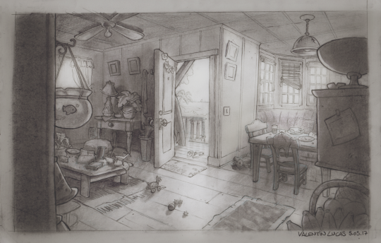
For Gobelins’ entering contest, one of the request is background skills, and the ability, with a pen, to visualize yourself in a 3D space.
So I gaved myself an exercice than can be similar to what you can have during the contest, and which are the steps I’m going through :
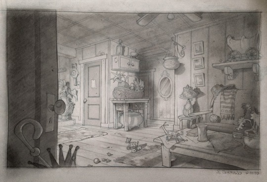
Here is a background concept done by Armand Serrano, for the movie Lilo and Stitch.
Let’s put the following consign : try to draw the “against field” of this place (it mean, as in cinema, shooting in the opposite direction to another shot)
For this, we must be aware to : – Place our virtual camera correctly – respect perspective rules -placing correctly our objects in the space (what does make the “link” between the two shots) – Keep a cool composition -respect the design -use our imagination to field the empty space
So, let’s do this !
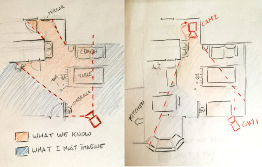
1. Making a Map and a good thumbnail
-It’s a good exercise to try put everything in a map, including the camera (CAM1) and visualize what we know and what we have to imagine ; not very easy, but it’s making win a lot of time for after !
– Then I just had to place the other camera (CAM2) on the other side, and begin to think about what would be in the room on the other side.
– When I did the map, I was working in the same time with a thumbnail of my scene (note : thumbnail is a very small drawing. Good to remember : small drawings for big ideas ! ) ; like this I could think about having a cool composition and match with the background in the same time. That’s why (as you might see) I decided to tilt a bit my CAM2, because I felt it more interesting for the composition.
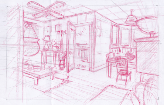
2. Ruff drawing
– So here begin the interesting part 🙂 it’s importent to begin by placing the horizon line, the vanishing points (in this case, two) and a perspective grid, all of this being sure it’s mathching with your thumbnail.
-Then, I built every objects, being sure it’s on the perspective, and puting all my ideas.
note : I was always thinking : this is a place where people are living, we have to FEEL It. It’s passing by using the props and the randomness of their position to suggest this idea.
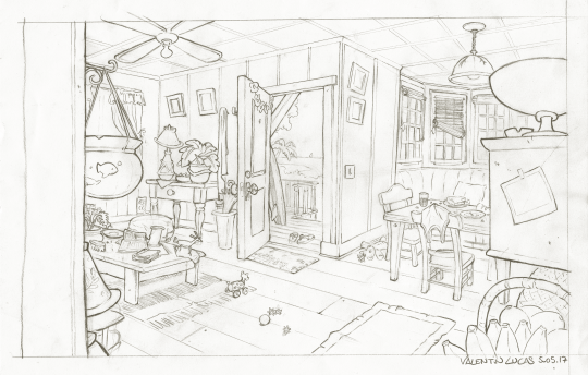
3. Line Up
– On this part I was always trying to be careful about keeping the style of the artist, about props design, and the way of working the line.
4. (Bonus) Shadows
– Personnaly, I wanted to try making she shadows on a traditionnal way, as they where doing before at Disney. For this I first scanned my drawing (to have a backup in case), then I used carbon powder, I was putting stronger at some places, using an eraser to have my lights, and my pencil to go into the detail in the lighting.
-It’s important, when doing lighting, to know where the light come from, and what you want to show. Contrast is the master word ; with the light and shadow, you can choose to show more one thing than an other (for example, I chosen to show less the left part, and put on the light the right part)
My drawing could be better, about the choice of props and the angle, but I hope this tutorial helped you to see better the process to draw an “against field” from an existing layout, hope you enjoyed 🙂
Im pretty shit at explaining things so i’ll use this for basic example. Firstly if you know how shadows work and stuff then it shouldnt be to hard. Otherwise go study that shit.
So you got your flat colors down for the first step
Next lay down a dark tone set to multiply, idk about 70% i guess? up to you
Start adding some shadows set on another multiply, shadows can be however dark. 50-70%
The add your light source, i used color dodge in this one. Dont use super bright color or it will look like blinding light. (again if you know light/shadows shouldnt be to hard)
I add a touch more dark in the shadows for effect…or something like that.
And there you have it, this maybe helpful lesson was brought to you by a potato, chur.