For Gobelins’ entering contest, one of the request is background skills, and the ability, with a pen, to visualize yourself in a 3D space.
So I gaved myself an exercice than can be similar to what you can have during the contest, and which are the steps I’m going through :
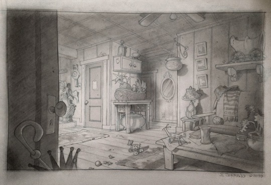
Here is a background concept done by Armand Serrano, for the movie Lilo and Stitch.
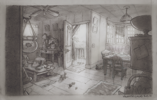
Let’s put the following consign : try to draw the “against field” of this place (it mean, as in cinema, shooting in the opposite direction to another shot)
For this, we must be aware to : – Place our virtual camera correctly – respect perspective rules -placing correctly our objects in the space (what does make the “link” between the two shots) – Keep a cool composition -respect the design -use our imagination to field the empty space
So, let’s do this !
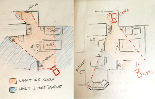
1. Making a Map and a good thumbnail
-It’s a good exercise to try put everything in a map, including the camera (CAM1) and visualize what we know and what we have to imagine ; not very easy, but it’s making win a lot of time for after !
– Then I just had to place the other camera (CAM2) on the other side, and begin to think about what would be in the room on the other side.
– When I did the map, I was working in the same time with a thumbnail of my scene (note : thumbnail is a very small drawing. Good to remember : small drawings for big ideas ! ) ; like this I could think about having a cool composition and match with the background in the same time. That’s why (as you might see) I decided to tilt a bit my CAM2, because I felt it more interesting for the composition.
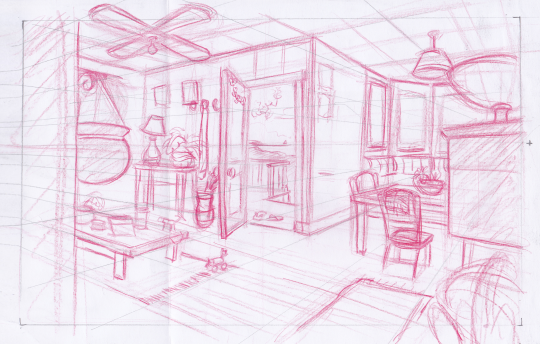
2. Ruff drawing
– So here begin the interesting part 🙂 it’s importent to begin by placing the horizon line, the vanishing points (in this case, two) and a perspective grid, all of this being sure it’s mathching with your thumbnail.
-Then, I built every objects, being sure it’s on the perspective, and puting all my ideas.
note : I was always thinking : this is a place where people are living, we have to FEEL It. It’s passing by using the props and the randomness of their position to suggest this idea.
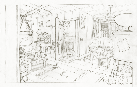
3. Line Up
– On this part I was always trying to be careful about keeping the style of the artist, about props design, and the way of working the line.
4. (Bonus) Shadows
– Personnaly, I wanted to try making she shadows on a traditionnal way, as they where doing before at Disney. For this I first scanned my drawing (to have a backup in case), then I used carbon powder, I was putting stronger at some places, using an eraser to have my lights, and my pencil to go into the detail in the lighting.
-It’s important, when doing lighting, to know where the light come from, and what you want to show. Contrast is the master word ; with the light and shadow, you can choose to show more one thing than an other (for example, I chosen to show less the left part, and put on the light the right part)
My drawing could be better, about the choice of props and the angle, but I hope this tutorial helped you to see better the process to draw an “against field” from an existing layout, hope you enjoyed 🙂