i’m getting a lot of salt and angst over that post almost entirely from young, white artists so i’m just gonna drop one statement on it.
obligatory “i’m white”. obligatory “i’m not the best artist and am still always learning”. obligatory “i was a beginner too”. fact of the matter is, though, that what i brought up in that post is not endemic only to beginner artists. it’s something i see very technically skilled people doing, and it demonstrates a very fundamental flaw in the notion of “aesthetic”.
altering a character’s features as portrayed in their canon (or god forbid, an actual real actor) so their complexion is creamier, their features are narrower, and their hair is smoother is a deliberate choice. art is translating lines and shapes into something cohesive and recognizable. you choose to make those lines.
if you are using the wrong ones, you lose cohesion.
stylization does not mean recognition is lost.
the situation described by my post can range anywhere from ignorance to the notion that the human face is not a template with interchangeable potato head parts all the way to a malicious belief that non-white features are ugly.
i’m not making accusations one way or another.
but i am saying that it’s very, very noticeable and the hurt you might feel by me calling you a fucking gremlin doesn’t really compare to people seeing themselves be erased in art. i am not engaging anybody directly over the matter because quite frankly 90% of the angst on that post is from teens. get better. use references. don’t be defensive when someone points out offensive behavior.
if you wanna do realistic hands i don’t think i can help you that much but if you wanna do more stylized and cartoony hand then that’s all the help i can give you
drawing 5 distinct fingers is tedious and feel unnatural, try sticking at least two fingers together and then dividing them in the clean phase.
remember: the best way to learn is to look at a lot of reference. draw your own hand that’s why we have two! one draws and the other is there for reference!!
Have you ever been trying to draw tiles on a wall or on the floor in perspective, but notice that after you’ve drawn them, they don’t look like they’re all the same shape or size?
Well here’s a tutorial on how to fix that.
Your picture probably looks like this, right?
Well, i’m here to tell you how to fix that…Let’s start out with your basics.
The gray line is the horizon line, and the black dot is your horizon line. These are essential for the first steps of perspective. Without these, your perspective may turn out wonky and just not flattering to the eyes. Right now we’ll work in One point perspective.
Now let’s pretend we’ll be drawing a hallway. Draw a vertical line where the edge of the wall is.
Now, from the tips of the bottom and top of your wall, you’re going to need to draw a line extending all the way to the vanishing point. If you’re working in photoshop you could either use the line tool, or shift+click. If traditional, you’ll need to use a ruler.
Now that we have the wall that’s in perspective, it’s time to draw the rest of the lines. here I’ve drawn the wall facing us that’s closest, the ceiling, the floor line, and the end of the hallway. ASSUMING that you are working in one point perspective, all vertical lines are straight and parallel to each other, and all horizontal lines are straight and parallel to each other.
Now here I have erased the lines that extended beyond the back wall, and found the center point of the edge of the left wall. From there, you draw an extended line just as before towards your vanishing point.
now make a vertical line where your first “tile” is.
now this may be a little hard to explain. Now you’re going to draw a line coming from the corner of the wall, through the corner where your line meets the tile you just drew, and all the way to the ground line.
You see where these two lines meet? you’re going to draw a vertical line to the ceiling from here.
Like so!
Now rinse and repeat! you should have perfectly even spaced tiles now! And if you have tiles on the ceiling
Just draw horizontal lines connecting to the vertical lines!
Now just erase anyhing you don’t need and…viola! Perfect tiles in perspective!!
Before you draw any gun, be absolutely certain you are familiar with the parts of a gun. That sounds cliché and dumb, but if you end up wondering “Why does this thing look so shitty?” it’s probably ‘cause you don’t know how a gun works. Know how it moves and what fits in where. And please know where the hands are placed when firing!!! If you hold a gun at the wrong place, you can lose a finger! Also know where the head will be positioned. The person will be looking down the barrel to line up the sights (the two protruding thingies at the top that help you pinpoint your target). Don’t know enough about guns, let alone what type to utilize? Here (the Glock and the “Frag Nade” are mixed up):
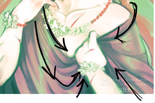
Aaah thank you! Well, first things first; learn from reference! You can google fabric reference or even just outfits and pay attention to the way the fabric swoops and curls around the form that its surrounding.
Here the fabric sweeps downwards, but comes up at a much tighter, sharper angle into his hand and bunches up within his palm. The material layers overtop of each other
This fabric is very loose and shimmery, and within the overlapping folds your shadows will be most prevalent to give it dimension of being layered.
Even with skin tight fabric there will always be creased, wrinkles, and layers where the material is pushed together. It is important to capture that! Whether the fabric is tight, or very loose. The tighter, the less wrinkle typically if it is pulled taught, while looser fabric will have more swooping lines of flow and tend to be thickly “banded” with spread out areas.
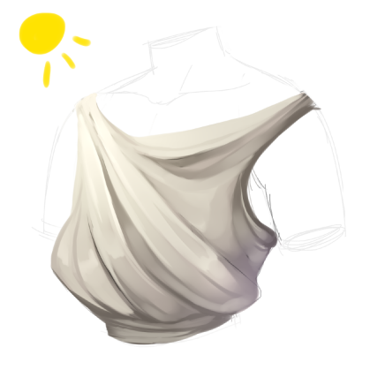
here is our mannequin torso for the purpose of visualization of the render process!
I start with the basic shape of what I want my clothes to be, and then i go from there to decide which way my fabric will be sweeping
now I block in colors, I always use a middle tone of the shade i want instead of the pure shade that I’m aiming for. The shade I’m aiming for I will use as a highlight to be where my lightsource is casting
I typically merge down at this point as I prefer to paint on one layer, and i start to blend and loosely figure out the way i’m going to further express the drape of my fabric
I refine and increase my brightness and darkness according to what i feel is needed to achieve my chosen contrast
refine, blend, and adjust as you need and to your personal preference!